
When Apple Music was first launched, it didn’t exactly sport the best user interface. It was admittedly rather confusing for users to try and navigate the app to find the songs they wanted, songs saved offline, as well as accessing some playback controls. Apple made some changes and improvements with iOS 10, but we reckon it could still be improved upon.
This is where designer Jason Yuan comes in. Yuan had recently applied for a graphic design internship position at Apple but was ultimately rejected. Despite being rejected his passion for design continues as he went on to produce his concept of a redesigned Apple Music. Continue below to read an excerpt of his experience redesigning Apple Music service.
“Apple Music has always frustrated me. What was meant to be the service to convert everyone in the world to streaming is going through puberty — a phrase which here means steadily maturing yet unattractive compared to the adults in the game (aka Spotify).
To better understand Apple Music, I took a trip down memory lane and revisited its inception. Plagued with a notoriously confusing interface and a half-baked visual identity, Apple Music’s first identity was the culprit of many headaches.
To remedy this, I approached my redesign in three steps, while conducting research throughout:
- Core Experience
- Brand Identity
-
Visual Interface
My Sampler
My Sampler was born out of the understanding that users who are picky about what goes into their library would also be more reluctant to sit through an entire playlist full of new music. A better experience would be presenting snippets — or samples — of curations that gives the user just enough information to decide whether or not to add it into their library and weekly playlist.
Upon entering the Sampler, the user is presented with a series of artist headshots that correspond to a curated song. The user can tap and hold to preview 15 seconds of each song, before swiping up to reject the song or swiping down to add the song to their library.
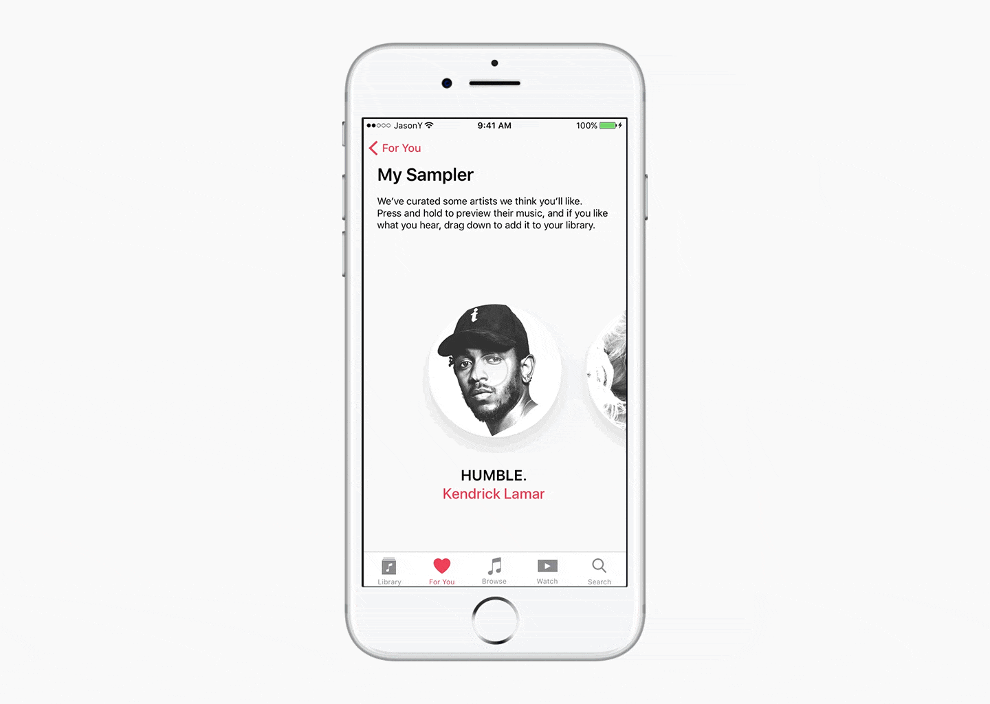
I chose to use gestural interaction so that users can use the Sampler even if they’re not looking at the screen. Once the user has finished sampling, their selections are used to create a New Music Mix that the user can listen to.
For You
“For You” is the beating heart of Apple Music. It’s where Apple Music gets to flex how much it knows about the user by curating playlists and albums based on what the user has “Loved.”
The redesigned “For You” begins with “My Sampler” in lieu of the current “My Favorites Mix” and “My New Music Mix”. “Recently Played” is kept intact, as users found it to be quite useful.
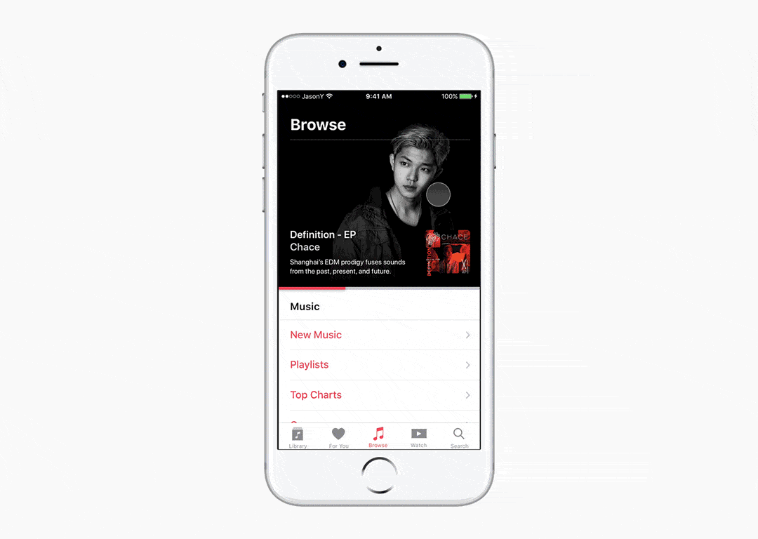
Browse
The majority of feedback I received regarding the current Browse screen was that it felt too sterile and uninviting. Some users also expressed confusion regarding the differences between “For You” and “Browse.”
My solution was to redesign the Feature Slides in the style of Apple’s Website — Jumbo slides that fill the viewport width, with a horizontal indicator of where the user is in the slideshow. I believe this change makes Featured content feel more inviting and less intrusive/random.
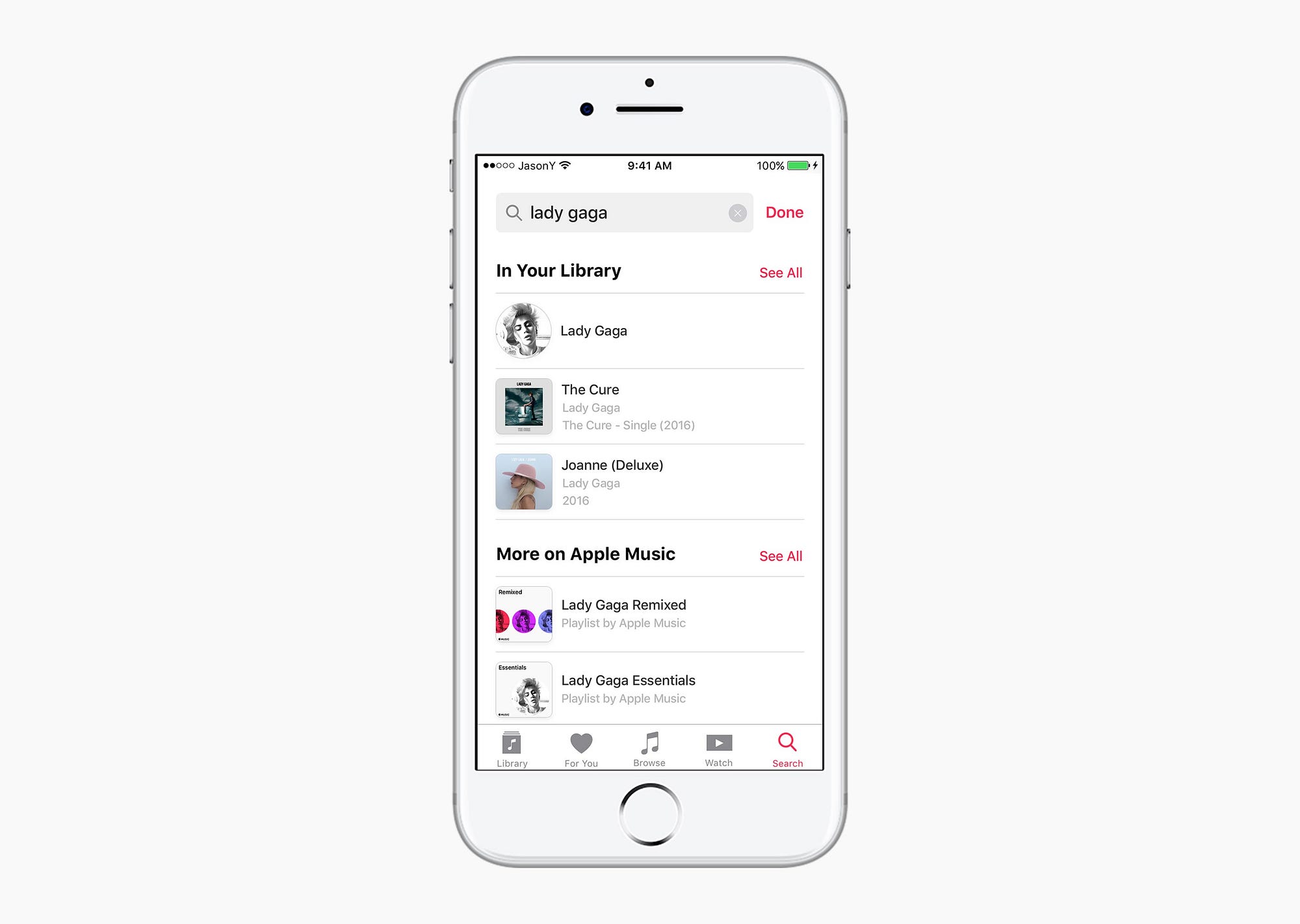
Search
The main problem with how Apple Music handles search right now is that it is based on a mode system: where you can either search in Apple Music or your library — but not both.
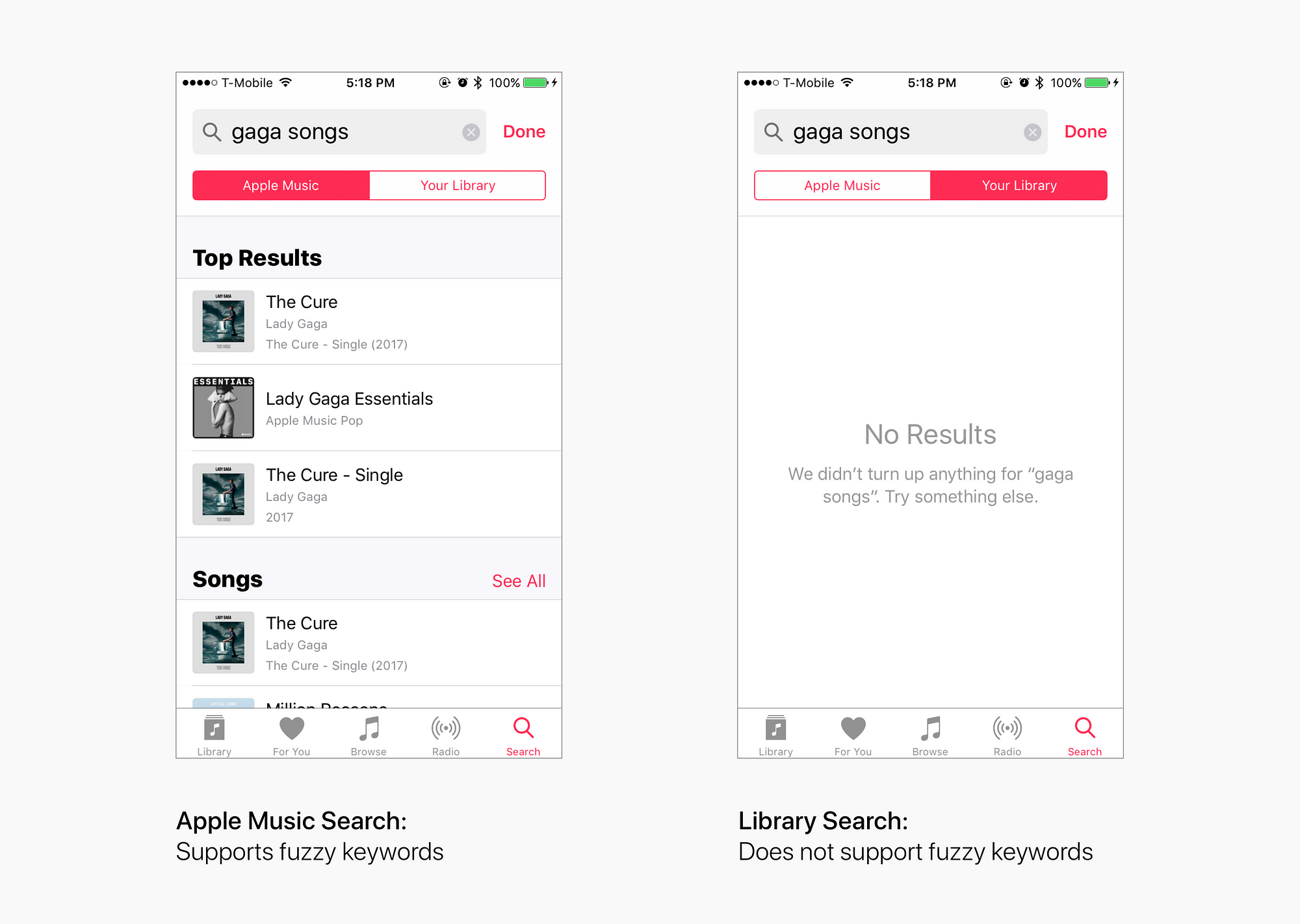
My solution was to merge the two modes into one general “search” that displays results from the user’s library first, followed by anything else that is available on Apple Music…..”
Jason Yuan concludes his post hoping his work will be able to give the folks at Apple some ideas and spark some conversations! We at Antler hope Cupertino snatches him right up or better still a rival company as Jason redesign touches on the little niggles that break UX singularity and discourages consumer adoption.
Read the original unedited article here